NorthVue Window Treatments
Logo Design
project brief
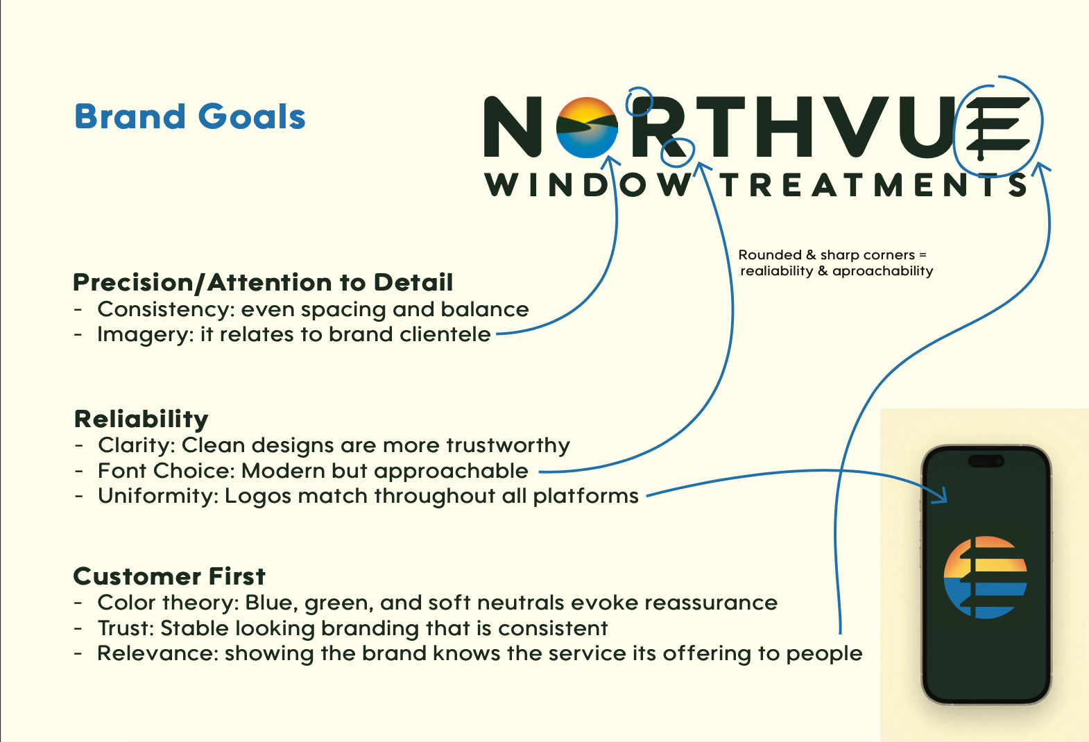
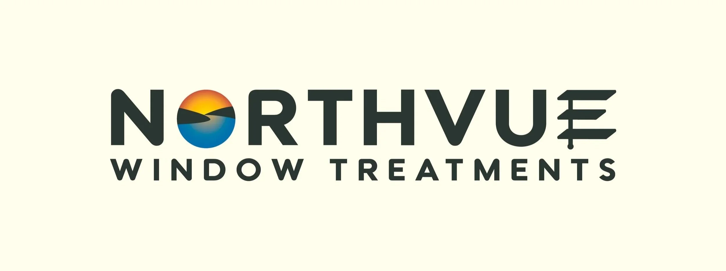
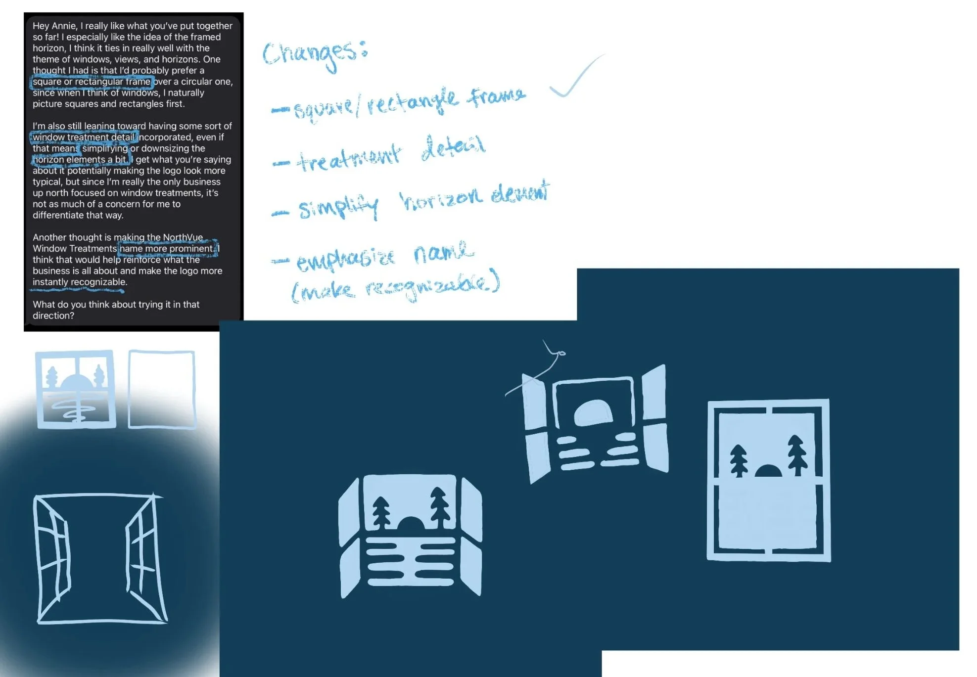
NorthVue Window Treatments needed a professional brand identity that reflected the beauty of Northern Michigan while building trust with an upscale residential clientele. The goal was to create a memorable logo that stood apart from competitors and clearly communicated the company's craftsmanship and reliability.
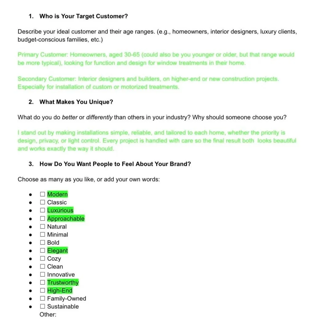
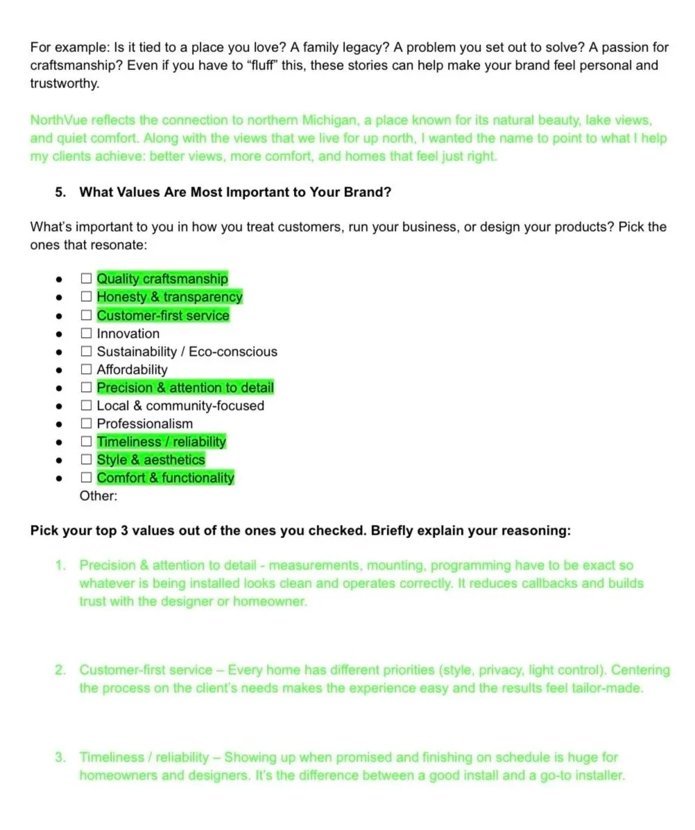
Client Homework

challenge
Many window treatment companies rely on generic window icons or blind graphics, causing their brands to blend together. The challenge was to create a distinctive identity that instantly communicated professionalism while appealing to homeowners investing in luxury spaces.
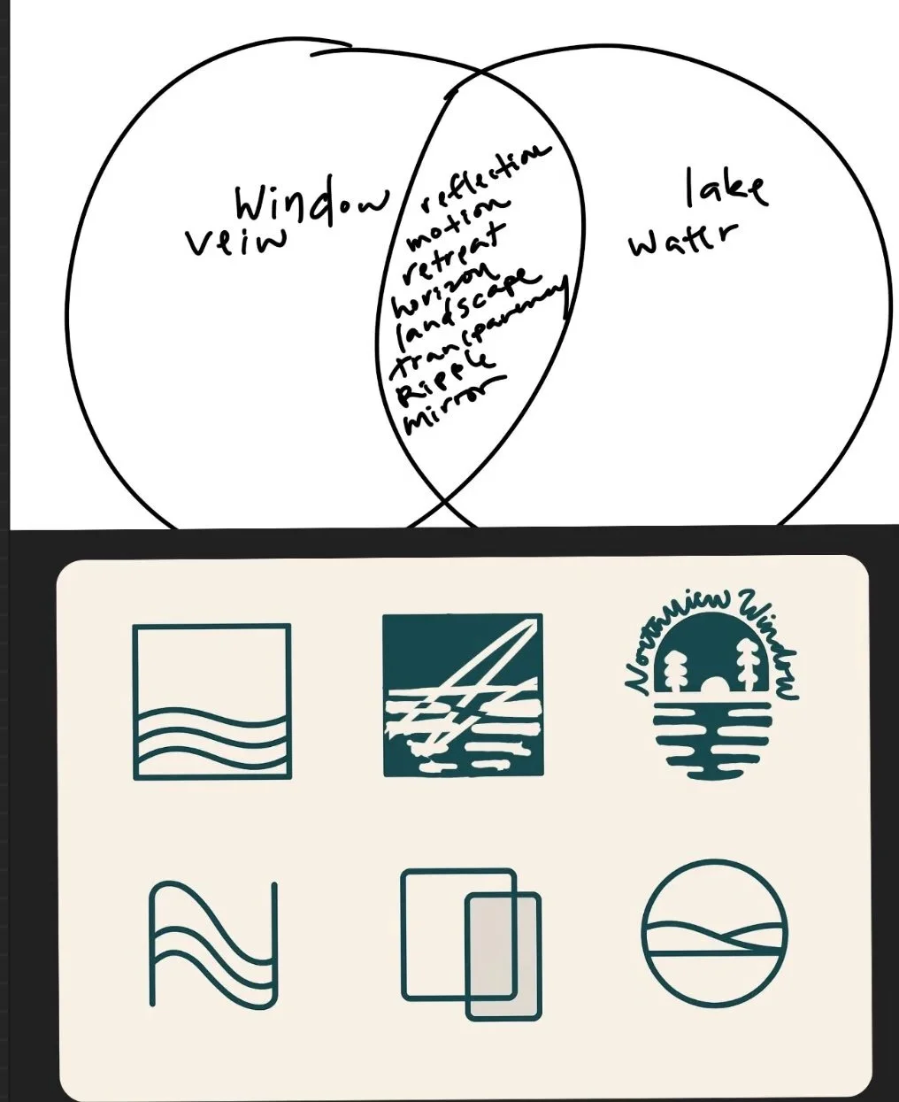
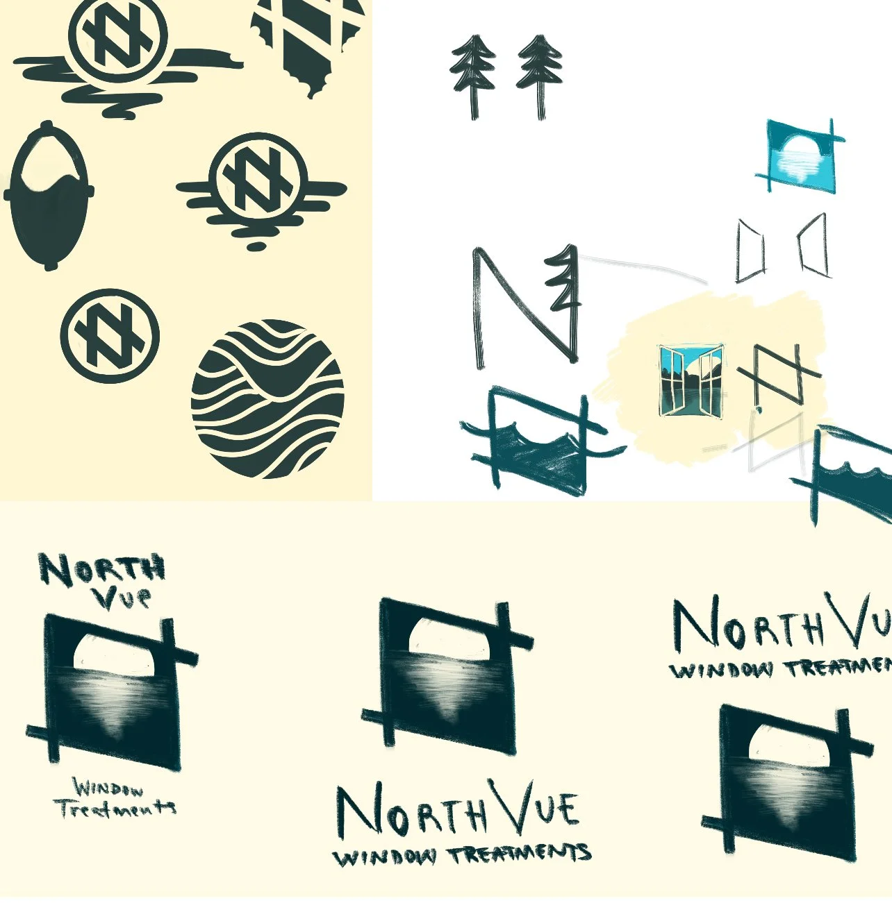
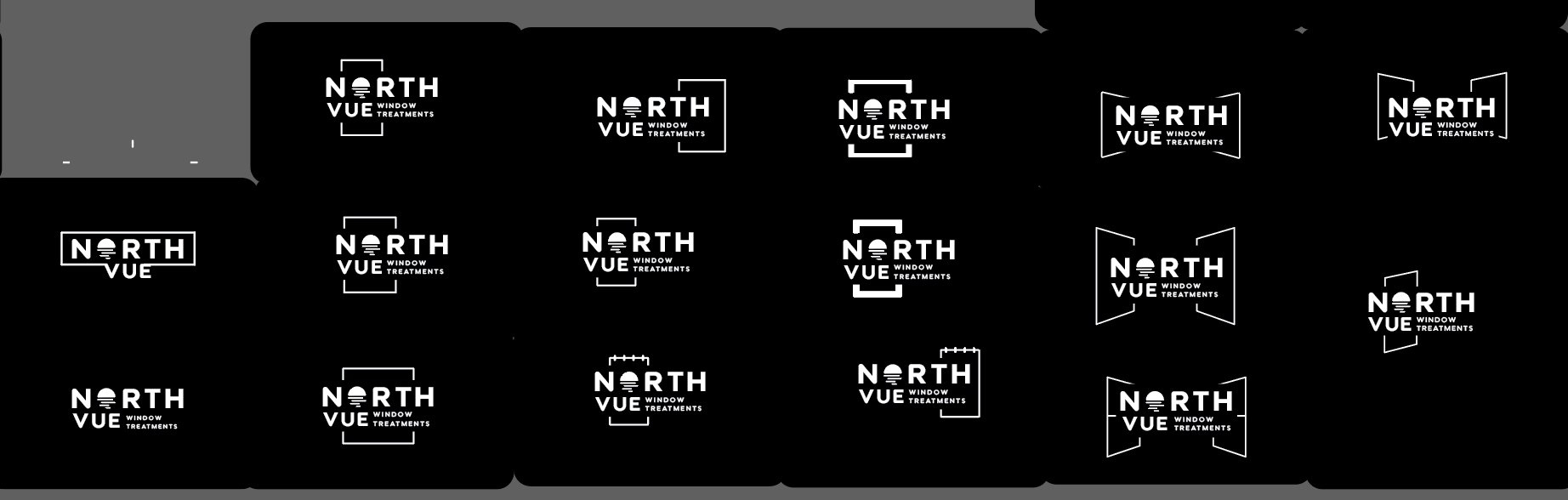
Ideation Process
solution
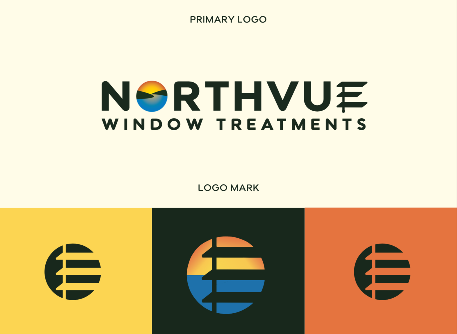
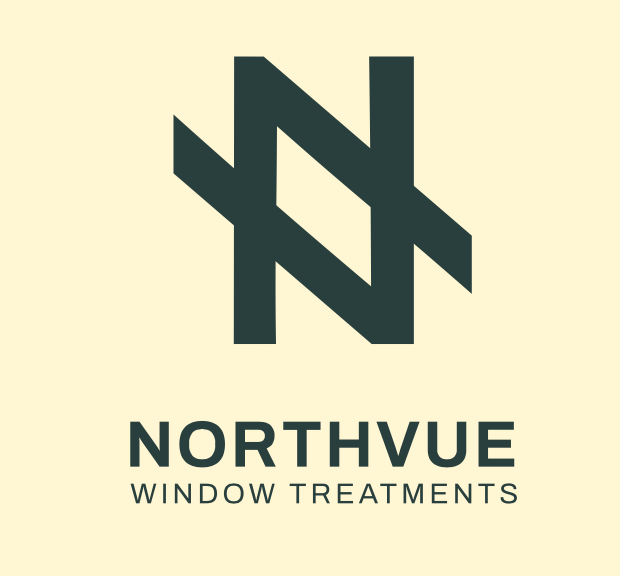
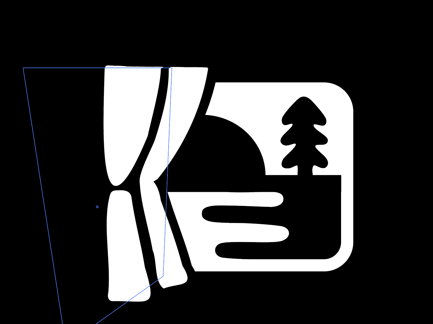
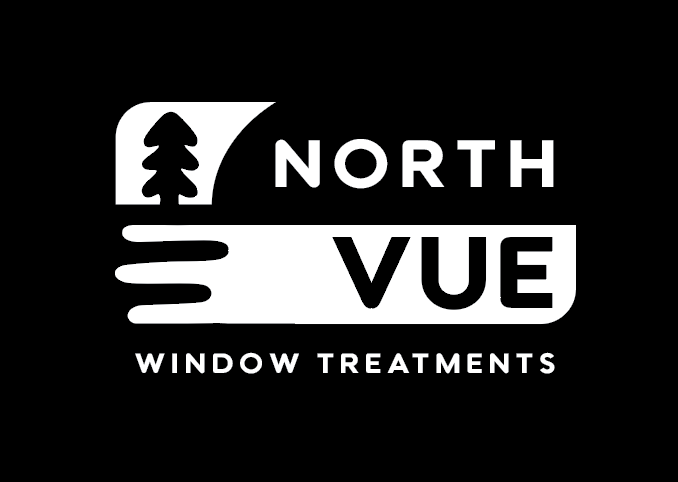
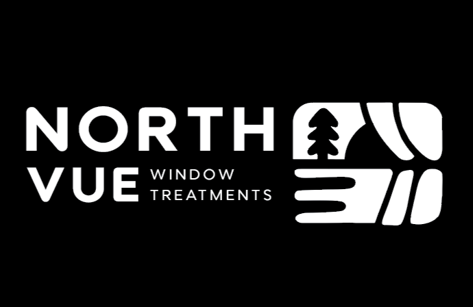
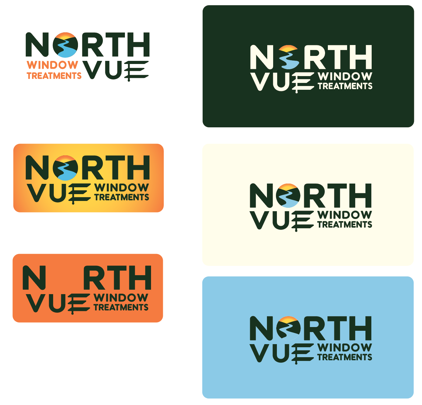
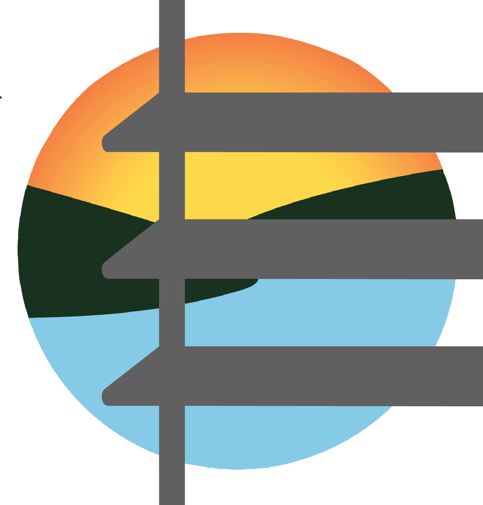
Rather than using another literal window icon, I embedded meaning directly into the typography. The "O" became a Northern Michigan sunset over the lake, while the "E" subtly references horizontal blinds—one of the company's most popular installations. Strong, structured letterforms reinforce reliability and craftsmanship, resulting in a logo that is recognizable, meaningful, and uniquely NorthVue.